Quick Navigation for an Open-Book Quiz
Enhancing an assessment experience for a digital book for young students.
Introduction
Company
Age of Learning
Product
My Reading Academy
Role
Lead Designer
Skills
interaction design, UI design, design systems, cross-platform design, prototyping, research analysis
Tools
Figma & Unity
My Reading Academy is a cross-platform app which teaches students in Pre-K to 2nd Grade how to read. The program includes effective educational content in the form of fun games, engaging videos, and interactive books. Its adaptive system personalizes the learning experience for each student in real time, delivering content and scaffolding to students that are curated for their individual needs.
TLDR
I was tasked with designing a way for young students to navigate an open book quiz, while keeping them focused on the main objective of finishing the assessment. What resulted was a design that not only allowed for students to achieve this efficiently, but was also aligned with educational concepts that could be used to model advanced reading techniques students would be taught later grade levels.
Project Context
Project Inception and Goals
Our digital book experiences help students practice reading and test their comprehension. In order to properly assess a student’s comprehension, we should ensure that it is only testing their ability to understand text, not their ability to remember it. So we needed to design our quizzes in a way that would allow students go to back into the book.
Here is how the basic user experience works for these books and their assessments.
Basic Flow
The students reads the digital book that’s assigned to them in My Reading Academy.
01
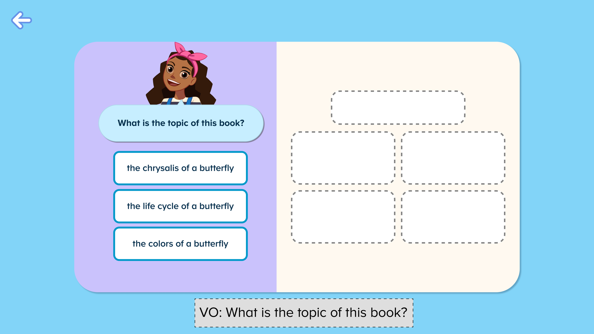
At the end of the book, the student must answer a quiz.
02
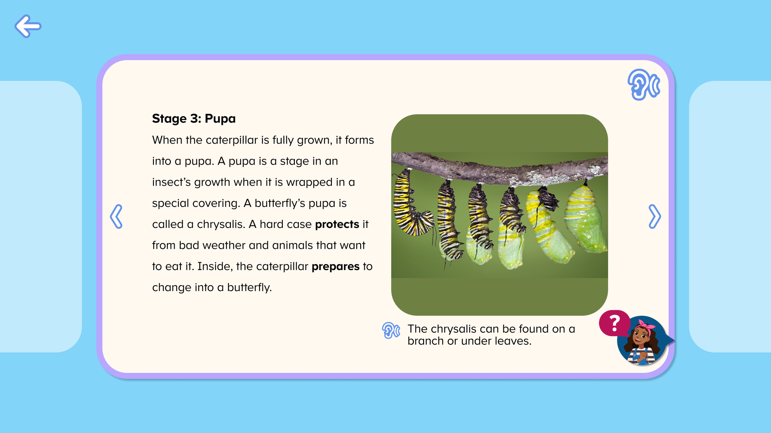
The student can reference the book during the quiz.
03
04
The student answers all 5 questions to finish the quiz and book activity.
Understand & Empathize
Who are we designing for?
This particular set of books would target 1st Grade - 2nd Graders. However, because of our adaptive system we also need consider that some advanced Kindergarteners could access this experience as well.
When designing for young audiences, it is also important to keep in mind that they can get distracted easily and can get restless if an experience is too long.
1st & 2nd Grade Students
🎯 Goals
Learning & practicing how to read. Their immediate goal in this experience is to answer a 5-part question about the topic and details about the book.
😒 Painpoints
Assuming our adaptive engine has correctly placed them, the assigned book has text that is above a comfortable reading level. Students do not have the ability to glance at a page and parse through content as quickly as an adult.
So how does this shape our design choices?
Design needs to be incredibly simple - in number of steps, interactions, etc. - so that it does not add to the inherent cognitive load from the higher reading level of the book.
Since students can only view one page at a time, it would be ideal to support a shortcut to specific pages during the quiz, since they have already read the content once through.
The quiz experience is the priority, while navigating the book is a supplementary experience. The design should not hinder the main task at hand.
Ideation
With the context of our users and design constraints in mind, I quickly started brainstorming, getting feedback from our curriculum specialists and developers.
These initial iterations helped me tinker with creative solutions while exploring what worked and didn’t work.
Initial Concepts
Concept 01:
Normal Navigation with a ‘Jump to Quiz’ Button
Uses the same iconography to return to the quiz in a different quiz type, so we explored its use case as a ‘jump to quiz’ feature + a frame on the pages to indicate the user was in ‘quiz mode’.
-
Users don’t need to learn a new way to navigate and can access the quiz very easily at any time.
-
This design does not provide any quick way to get to a specific page. This will only worsen when the page count increases for future grade levels.
Concept 02:
Drawer Navigation
A “drawer” navigation that pulls up from the bottom, which horizontally scroll to view page thumbnails.
-
This design has proven usability with young students in other Age of Learning Products
-
The Quiz Page, which is the last page of the book, competes with the rest of the pages in the drawer. This design can be problematic when we have many more pages for future grade levels.
Concept 03:
Immersive Navigation
An interesting and fun approach that makes use of the space in which our pages live.
-
Allows for bigger page thumbnails than the drawer navigation. A user could toggle between book pages and the quiz page.
-
Conceptually abstract, and is most likely not intuitive for young students to learn, and might be a more distracting experience.
Concept 04:
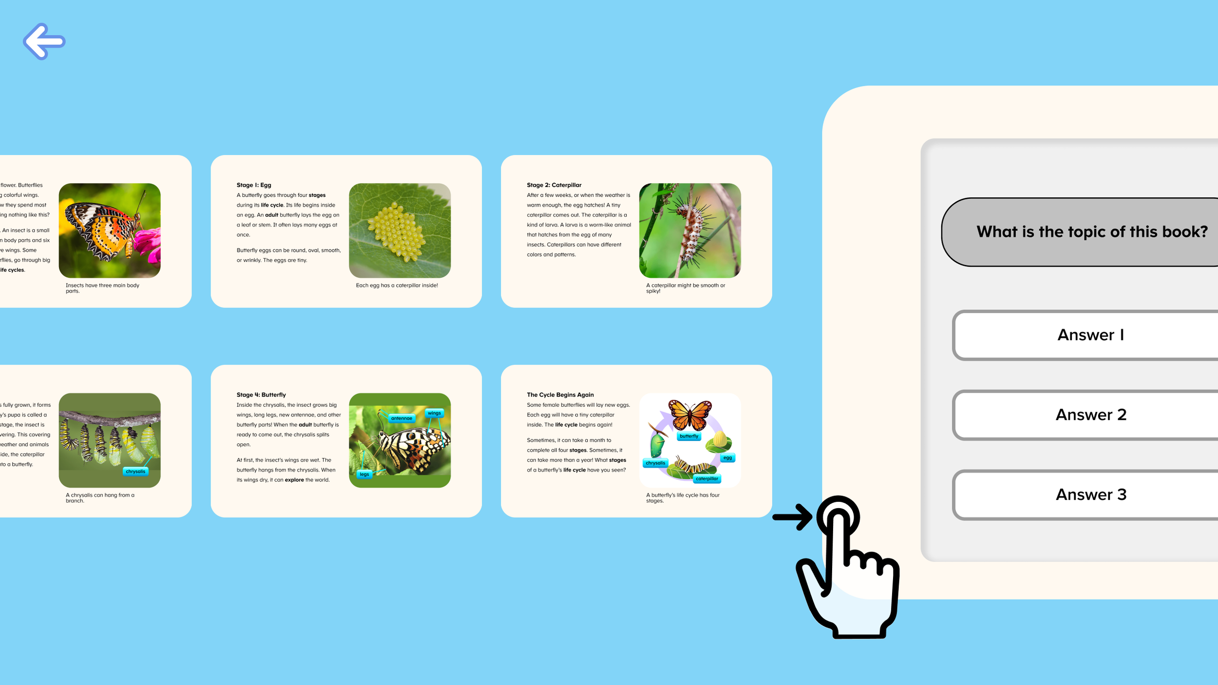
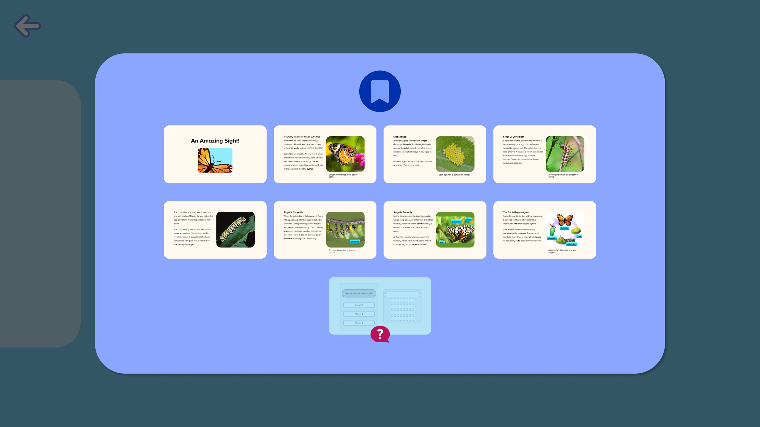
Table of Contents Style Menu
A menu style of viewing the pages that can be used to navigate to a specific page.
-
Can view 12 pages at once, so a user could access a page quickly with very few interactions with the screen. This menu could also easily accommodate more pages in future grade levels, if necessary.
-
A table of contents isn’t something that kids this age have likely seen yet in other digital books, so we can’t assume that they will have an immediate understanding of its purpose.
The Table of Contents Style Menu emerged as the strongest design due to its simple interactions, ease of viewing, scalability, and being akin to a feature of advanced books.
As I continued to iterate, I considered the elements we wanted to prioritize in the experience to improve the design further.
We ultimately named this feature the Quick Navigation Menu or ‘Quick Nav’ for short.
Proposed Design: Key Features
A brief tutorial was added to introduce the menu to the student.
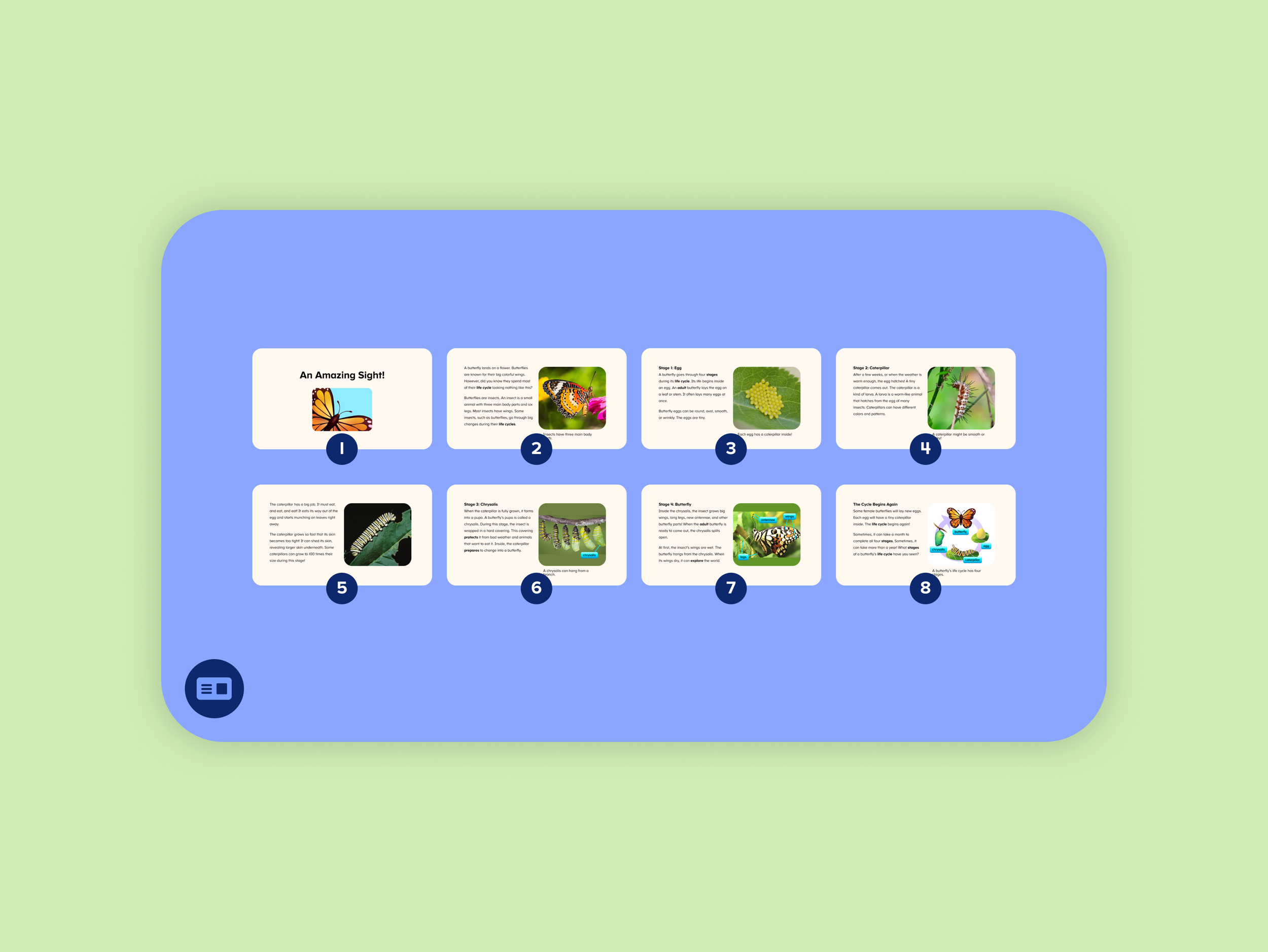
Numeration added to help contextualize thumbnails as sequence of book pages.
The menu can present up to 12 pages at once, and can accommodate more if needed.
Switched the swipe interaction to a toggle button in the bottom left corner, which lets the user easily open and close the menu over the quiz page. This would be more user friendly for our potential Kindergarteners entering the experience.
Opening the page inside of the menu instead of traveling back within the book, prevents the user from going too far from the quiz page.
Validation
Putting the design to the test
For our usability tests we wanted to evaluate the utility of the design on the following:
Do students understand how to use the Quick Nav Menu?
Do they understand its purpose?
Do the thumbnails provide a clear call to action? Do they recognize which page they are trying to navigate to?
How much tutorialization is needed with this design?
Usability Test Findings
We tested a Figma prototype with 8 students ages 6-7 years old on tablet devices and found that the design was largely successful in communicating it's utility to our young students.
✱ Design was intuitive to use for most users
Users interacted with the menu with ease. Almost all users understood that the purpose of the feature was to provide a quick reference back to the book if they needed it, although only some used it for this purpose. Most users explored the Quick Nav out of curiosity or did not need it to answer the questions.
✱ No further tutorialization was needed
The brief mention of the feature was enough to communicate its purpose.
✱ Confusion with the exit button
Kids showed some confusion around the exit button while the quick nav was open, mistaking it for a general back button instead of an exit from the entire activity.
Real Quotes From Kids
When testing with young ages, we often cannot expect them to fully articulate what they perceive or understand from an experience. Therefore, when they are able to articulate a feature’s purpose well, it gives us confidence that an experience being communicated clearly.
[What do you think that is for?]
“To show you all the pages, so that way you know which is the answer.”
[How would you use it?]
“I would go tap on it and see the pages...if I go to the last (page), I would figure it out.”
[Why would you use that button (Quick Nav)?]
“To check...to see, like if you dont remember you can go back and listen to it again.”
Based on these results and observations, we found that the design was largely successful in communicating it's utility to our young students, with some opportunities to fix some minor usability issues.
Design Recommendations
We opted to remove the exit button while the Quick Nav Menu is open, and allowed for more flexibility by allowing users to close the menu by tapping outside of it.
Final Design
Outcomes & Next Steps
Outcomes
Our curriculum team was excited to see that the Quick Nav was so successful in showing young students how to easily go back into the book and why that technique might be useful to them. Using a Table of Contents is a skill that is typically used with older students as books start to have more content to parse through, and being able to model this skill earlier was a big bonus with this project — so much so that this was one of the major parts that would be demo’d by our sales team when showing off MRA with potential customers.
Next Steps
After our release, we have observed students using the Quick Nav feature with ease when it is available to them. However, our learnings shouldn’t stop here.
We can validate our designs further to see if the proposed design actually improves outcomes when comparing it to the baseline of allowing the student flip back in the book normally, without a quick way to jump straight to a page.
For next steps, I would recommend A/B testing the feature and evaluating its impact on the following KPIs:
Higher activity completion rates
Faster activity completion time
Higher pass rates
As an educational app, our success metrics are correlated to effective and efficient learning. By looking at these metrics, we can validate our assumptions for the need for this feature and further increase our understanding about our users.
